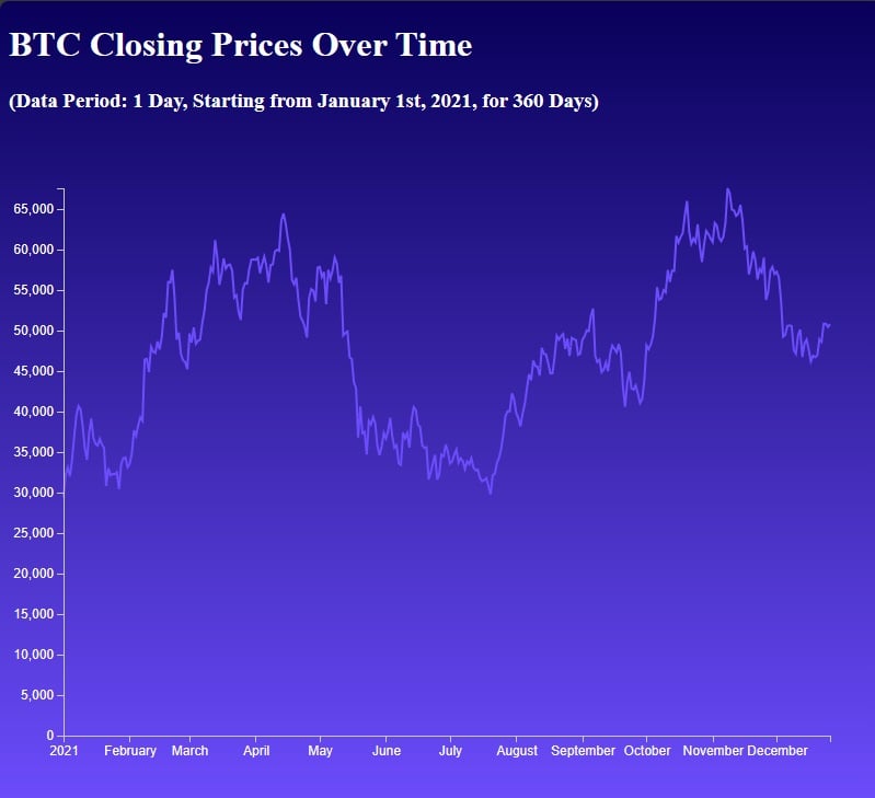
Creating a historical crypto price chart using CoinAPI and D3.js
In this tutorial, you'll learn how to build a historical cryptocurrency price chart.
On the agenda 🔥:
- Fetch cryptocurrency data using CoinAPI and JavaScript.
- Transform and prepare the data for visualization.
- Create a historical price chart using
D3.js. - Style your chart
CoinAPI: Comprehensive Cryptocurrency Data Solution 🚀
Just a quick background about us. CoinAPI is your one-stop solution for cryptocurrency data. We offer seamless access to real-time and historical financial data from hundreds of exchanges. Whether you're looking for raw trading data, OHLCV, or specific events, we've got you covered.
We support multiple data delivery methods like REST, WebSocket, and more. Perfect for developers looking to build anything from trading algorithms to financial visualizations.
Let's set it up 🚀
CoinAPI is your go-to platform for obtaining real-time and historical cryptocurrency data, featuring comprehensive API solutions suitable for developers and financial analysts alike.
Coupled with D3.js, a javascript library for data visualization, you have the perfect toolkit for crafting sophisticated, real-time financial dashboards or trading algorithms.
In this tutorial, you'll learn how to utilize CoinAPI's RESTful API in a web environment to fetch cryptocurrency data.
You'll also learn how to visualize data using D3.js.
Getting Started
First, create a new project folder on your computer and name it crypto_price_chart.
Inside this folder, create three files: index.html, style.css, and script.js.
Setting Up the API Request
To fetch data from CoinAPI, we'll first need to make an API request. This will require an API key, which you can obtain by registering at the CoinAPI website.
Code Snippet: Prepare index.html
Here's the basic structure of a web page designed to visualize cryptocurrency
closing prices over a specified period using D3.js.
<!doctype html>
<html>
  <head>
    <title>Coinapi</title>
	<script src="https://d3js.org/d3.v6.min.js"></script>
	<script src="script.js"></script>
	<link rel="stylesheet" href="style.css">
  </head>
	<h1>BTC Closing Prices Over Time</h1>
	<h3>(Data Period: 1 Day, Starting from January 1st, 2021, for 360 Days)</h3>
	<svg width="800" height="600"></svg>
</html>
Code Snippet: Fetching Data from CoinAPI
Create a function in your script.js to fetch historical data.
const API_KEY = "YOUR_API_KEY_HERE";
const url = `https://rest.coinapi.io/v1/ohlcv/BITSTAMP_SPOT_BTC_USD/history?apikey=${API_KEY}&period_id=1DAY&time_start=2021-01-01T00:00:00&limit=360`;

async function fetchData() {
  try {
    const response = await fetch(url);
    if (!response.ok) {
      throw new Error('Network response was not ok');
    }
    const data = await response.json();
    return data;
  } catch (error) {
    console.error('Error fetching data:', error);
    throw error;
  }
}
Preparing the Data
After fetching the data, it needs to be prepared for charting.
We'll create a simple function to transform the data into a format that D3.js can easily interpret.
Add it to the end of script.js.
Code Snippet: Data Transformation
function transformData(data) {
  return data.map(entry => ({
    date: new Date(entry.time_period_start),
    price: entry.price_close
  }));
}
Now let's dive into building the chart.
Code Snippet: building chart with D3.js
Add this code at the end of your script.js file.
document.addEventListener('DOMContentLoaded', () => {
  const svg = d3.select("svg"); // Select the existing SVG element in the HTML

  fetchData()
    .then(data => {
      const transformedData = transformData(data);

      // Define chart dimensions
      const width = 800;
      const height = 600;
      const margin = { top: 50, right: 50, bottom: 50, left: 50 };

      // Create a group for the chart elements
      const chartGroup = svg.append("g")
        .attr("transform", `translate(${margin.left}, ${margin.top})`);

      // Create scales
      const xScale = d3.scaleUtc()
        .domain(d3.extent(transformedData, d => d.date))
        .range([0, width - margin.left - margin.right]);

      const yScale = d3.scaleLinear()
        .domain([0, d3.max(transformedData, d => d.price)])
        .range([height - margin.bottom - margin.top, 0]);

      // Create a line generator
      const line = d3.line()
        .x(d => xScale(d.date))
        .y(d => yScale(d.price));

      // Draw the line
      chartGroup.append("path")
        .datum(transformedData)
        .attr("class", "line")
        .attr("d", line);

      // Add axes
      chartGroup.append("g")
        .attr("class", "x-axis")
        .attr("transform", `translate(0, ${height - margin.bottom - margin.top})`)
        .call(d3.axisBottom(xScale));

      chartGroup.append("g")
        .attr("class", "y-axis")
        .call(d3.axisLeft(yScale));
    })
    .catch(error => console.log(error));
});
Code snippet: styling the chart
Now, let's style your chart using the provided CSS.
Add the following CSS to your style.css file:
body, h1, h2, h3, p, ul, li {
  margin: 5;
  padding: 0;
  color: white;
}

/* Set a gradient background for the body */
body {
  background: linear-gradient(to bottom, #080059, #6C4CFC);
}

/* Style the SVG container */
svg {
  background-color: transparent; /* Transparent background for the chart */
}

/* Style the chart line */
.line {
  fill: none;
  stroke: #6C4CFC; /* Purple color for the line */
  stroke-width: 2;
}

/* Style the x-axis */
.x-axis path,
.x-axis line {
  fill: none;
  stroke: #ccc; /* Light gray color for x-axis lines */
  shape-rendering: crispEdges;
}

.x-axis text {
  font-size: 12px;
  fill: white; /* Text color for the x-axis labels */
}

/* Style the y-axis */
.y-axis path,
.y-axis line {
  fill: none;
  stroke: #ccc; /* Light gray color for y-axis lines */
  shape-rendering: crispEdges;
}

.y-axis text {
  font-size: 12px;
  fill: white; /* Text color for the y-axis labels */
}

/* Style the legend */
.legend {
  font-size: 16px;
  text-align: right;
  color: white; /* Text color for the legend text */
}
Testing Your Chart
Save all your files and open index.html in a web browser.
You should see a beautiful historical crypto price chart generated from real data!
